

How do you make luxury feel like a pause, not a display?
2026 | REAL ESTATE
VISĀVA
THE LOCAL MOTIVE
In a city that rarely slows down, VISĀVA was imagined as a different kind of luxury one rooted not in spectacle, but in space, stillness and a sense of belonging.
Nestled in Versova, VISĀVA takes its name from the neighbourhood’s association with rest and retreat.
Historically, Versova was a coastal hamlet and a pause point for seafarers a place to stop, recharge and continue.
We translated this idea of rest as a way of living into a brand that feels contemporary yet deeply connected to its surroundings.
VISĀVA is not simply a residential address. It is a philosophy of living in a place to slow down,
reconnect and make space for the life you want to live.
RESEARCH AND STRATEGY :
Competitive analysis, LOCAL walks, Stakeholder workshop
DESIGN:
Brand Copy, Identity System, Creative Direction, Visual Language
ACTIVATION:
OOH, brochure and coffee table book

DESIGN PROBLEM
Mumbai’s luxury real estate landscape is saturated with brands that communicate aspiration through scale, exclusivity and grandeur. VISĀVA sought to take a quieter, more experiential approach, rooted in Versova’s coastal character and its history
as a place of pause and retreat. The challenge was to translate this idea of rest, wellbeing and belonging into a contemporary luxury proposition creating a distinctive brand that felt premium yet understated, rooted yet modern, and could carry this sense of calm consistently across every touchpoint.

THE SPIRIT OF VERSOVA
Our LOCAL walk through Versova revealed a neighbourhood shaped by coastal heritage, community, nature and informal visual expression. Koli and nautical influences are visible through sea-inspired motifs, building names, fish imagery and woven textures, while colourful homes, hand-painted signs, geometric patterns, plants and personalised details give the village its distinct character.
The area also reflects a strong connection between nature and urban living, with coconut trees, leafy compounds, balconies and quiet lanes woven into the dense cityscape. Despite its proximity to Mumbai’s fast-paced urban life, Versova retains a sense of breeziness, warmth and slower community living. Together, these observations reveal a locality where the coastal and urban, natural and built, traditional and contemporary coexist organically forming a rich visual and cultural language for VISĀVA.
WORKSHOP
The workshop positioned Viceroy’s Versova offering as a quiet, contemporary form of luxury rooted in nature, culture, and experience rather than ostentation. The vision is to combine modern, understated design with expansive living, greenery, mangroves, and subtle references to Versova’s Koli heritage, creating a serene alternative to the energy of Bandra and Juhu.
The brand should feel young, international, warm, approachable, and authentic, while building a stronger connection with the local community. The customer experience should move beyond a transactional real-estate relationship through storytelling, hospitality, personalised service, and thoughtful touchpoints across the journey. Overall, Viceroy aims to establish a sense of escape, belonging, privacy, and community through practical, understated luxury, where the quality of the experience is as important as the product itself.


BRAND STRATEGY
The Brand Strategy translates the insights from the workshop into a clear and cohesive foundation for the brand. It defines who the brand is, what it stands for, how it is positioned, and how it should be perceived, bringing together its name, personality, values, and positioning. Together, these elements establish a distinctive brand identity that can consistently guide its communication, visual language, and overall customer experience.


WHY VISAVA ?
Rooted in Versova, VISĀVA takes its name from the neighbourhood’s history as a place of rest and pause
for seafarers and travellers. This idea of retreat became the foundation of the brand bringing a sense of calm, rootedness, and respite into contemporary urban living.
More than a name, VISĀVA represents a way of living centred around wellbeing, balance, and reconnection.
It captures the idea of slowing down, stepping away from the pace of the city, and creating space
to recharge, reset, and reconnect with oneself.
BRAND DESIGN
The Brand Design translates VISĀVA’s strategy into a visual world rooted in quiet luxury, depth, and a strong sense of place. It brings together Bombay’s coastal character, natural surroundings, and cultural heritage with a contemporary design language—creating an identity that feels warm, refined, and intentional rather than overtly opulent. Every visual element works to express VISĀVA as a sanctuary within the city: soulful, understated, and designed for a more meaningful way of living.


VISUAL ANCHOR
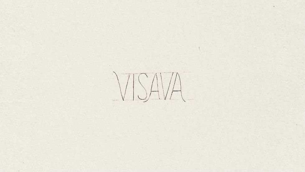
The VISĀVA ‘S’ acts as a distinctive visual anchor derived from the logo and inspired
by the fluid movement of a wave. Used as a continuous single stroke, it becomes
a flexible graphic device that carries the brand narrative across different touchpoints.
Its flowing form creates a visual connection between VISĀVA and Viceroy, while reinforcing the ideas of movement, rest, continuity, and a strong sense of place.


COLOUR PALETTE
The colour palette draws directly from Visava’s natural and coastal character, translating the landscape of Versova into a warm, grounded visual language.
Deep greens reflect the mangroves and coastal ecology, while earthy browns
and moss gold bring in the textures of sand, shore, and land.
Softer seashell white and aqua blue introduce the calmness of the beach, sea, and tidal rhythms. Together, the palette creates a balance of nature, heritage, warmth,
and coastal serenity, reinforcing VISĀVA’s understated and rooted approach to luxury.


ICONS
The icon set is built around a consistent visual language that reflects the brand’s core identity. Each icon combines organic, fluid forms with expressive calligraphic strokes, creating a balance between softness and movement. Together, these elements
form a cohesive system that can be adapted across different applications while maintaining a distinct, handcrafted character.


BRAND ILLUSTRATIONS
The illustration style brings VISĀVA’s world to life through vibrant, dreamlike watercolour visuals. Soft textures and fluid forms capture the experience of living among nature, amenities, and the surrounding neighbourhood, allowing the illustrations to communicate both the property and the lifestyle around it.
From building views and architectural details to people, beaches, greenery,
and distinctive local elements, the system creates a sense of warmth, movement,
and lived experience while keeping the visual language rooted in VISĀVA’s calm, coastal character.


BRAND PHOTOGRAPHY
The photography direction captures VISĀVA as an immersive, sensory escape rooted in Versova, using natural light, tactile textures, elevated perspectives, and intimate human moments to communicate a slower, more intentional way of living. Images should feel warm, atmospheric, and lifestyle-driven, balancing expansive views of
the sea, mangroves, landscape, and architecture with close-up details of materials, shadows, waves, and organic forms.
People are shown subtly through candid, in-the-moment perspectives rather than posed portraits, allowing the viewer to feel present within the scene. Across interiors, exteriors, amenities, and surrounding nature, the visual language emphasises warmth, spaciousness, movement, and a strong connection between the built environment
and its coastal setting.


BROCHURE
The brochure brings the VISĀVA brand world together into a tangible experience, translating its promise of quiet luxury, rooted living, and thoughtful design into a clear and immersive narrative.
Every element from imagery and typography to colour, language, and spatial storytelling is designed to help the reader experience VISĀVA not simply as a residence, but as a slower, more intentional way of living, deeply connected to Versova and its surroundings.


