

How can gourmet snacks connect Indian diaspora to their South-Indian roots?
2026 | F&B
In Good Co
THE LOCAL MOTIVE
Cafés today function as extensions of personal and social identity. They are chosen not only for what they serve, but for how they make people feel—whether they enable productivity, foster connection or offer familiarity within an increasingly fast-paced urban life.
Yet much of India's café landscape continues to rely on borrowed global aesthetics and hospitality conventions, creating spaces that feel visually polished but culturally detached. This disconnect became the foundation of our inquiry.
What would a contemporary Indian café look and feel like if it were imagined from India, rather than imported into it?
To answer that, we looked beyond cafés, studying neighbourhood dynamics, informal gathering rituals, evolving urban behaviours and global hospitality movements to understand what creates a genuine sense of belonging.
The ambition was never to design another café brand. It was to define a new approach—one that is culturally rooted, globally aware and adaptable across cities without losing its connection to place.
By placing culture, research and lived experience at the beginning of the design process, we set out to build a hospitality brand shaped as much by people and neighbourhoods as by products and spaces. Through ethnographic observation, consumer behaviour studies and cultural mapping, we explored not just how people use cafés, but why they return to them.
RESEARCH AND STRATEGY :
Competitive analysis, LOCAL walks, Stakeholder workshop
DESIGN:
Brand Copy, Identity System, Creative Direction, Visual Language, Photography and Videography
ACTIVATION:
Menu, Packaging, Social Media, Environmental graphics, Merchandise
"Local understands brands and their founders. They make an active effort to know you and to understand what you stand for. Its a journey that founders and brands must embark on. Would I recommend them? Absolutely.
Kalkandu was seen as a fringe, hipster friendly and boutique brand. We've moved on from there to become an aspirational and luxury snacking company. We're probably one of the only if not the only South-Indian gourmet snacks and beverages company out there right now since the rebranding."

Aryaman Birla
Founder, In Good Co
DESIGN PROBLEM
In an increasingly homogenous café landscape, the challenge was not to create another café, but to redefine the contemporary Indian neighbourhood café. The goal was to build a hospitality brand rooted in modern India without relying on familiar cultural tropes, while remaining relevant to a global audience. Beyond coffee, the opportunity was to create a brand people return to for connection, comfort and belonging. Guided by the pillars of Empathy, Everyday Extraordinariness and a Progressive Indian outlook, the experience celebrates everyday moments while reflecting the aspirations of a new generation of Indians.


Third Spaces
As a generation, we have become accustomed to being both traditional and modern, quiet and expressive. Our third spaces increasingly reflect this duality. There is a demand for such places that can flexibly accommodate, space to simply be themselves, or experiment with who they are. Even in an increasingly digital world, we continue to seek physical connections in shared places. We're witnessing a renewed interest in spaces that invite people to gather not through obligation, but through shared interests and everyday rituals.
Meaningful third spaces understand - people don't return because a place serves good coffee, or occupies a convenient corner. They return because, over time, a place begins to recognise them.
Cafe culture of India
Over the last few months, we’ve been observing how people occupy third spaces across India.
And one thing keeps standing out: the most meaningful cafes today aren’t built around coffee alone - they’re built around subcultures.
Around shared interests
Repeated rituals.
People finding belonging in the same spaces, again and again.
Maybe that’s what the new Indian hangout really is.


Workshop
LOCAL facilitated immersive strategy and co-creation workshops to align stakeholders around a shared vision for the brand. Drawing on insights from local walks, consumer research and focus groups, the workshops explored customer journeys, brand personality, hospitality rituals and the values of the progressive Indian consumer. Through exercises such as visual card sorting, subculture exploration, naming and experience mapping, the team uncovered the cultural cues and everyday rituals that would define the café. The workshops translated these insights into clear principles for the customer experience, verbal identity, visual language, menu philosophy, spatial design, sensory experiences and service. By aligning diverse perspectives around a common vision, LOCAL ensured that key design decisions emerged from the insights from the workshop.


The Meaning of
In Good Co
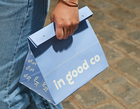
The naming strategy created a platform that expresses the brand's philosophy while remaining adaptable across formats, geographies and future extensions. In good co draws from the phrases "in good company" and "India's good coffee," positioning the café as a place for connection, belonging and shared experiences. The abbreviation "co" was intentionally designed as a multi-layered device, representing Company, Coffee, Conversations, Community and Collective; reflecting the brand's role within a neighbourhood. The name also functions as a scalable naming architecture, enabling hyperlocal adaptations such as In Good Company of GK2 and In Good Company of Gangtok. This flexible system allows each location to express its own neighbourhood identity while maintaining a consistent, recognisable brand for future expansion.




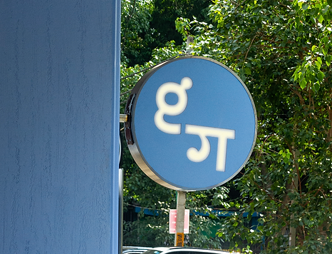
The Story behind G-Gaa
Our mnemonic and wordmark was custom drawn. The knot motif in the letterforms of the mnemonic is the defining characteristic. More than a visual detail, the knot represents the heart of “in good co”: community, connection, and the relationships that are formed over shared meals and conversations. The knot acts as the structural anchor of the mark, balancing the weight of the two letterforms while maintaining legibility and rhythm. The mnemonic is intentionally modular. While the customised 'g' with its signature knot acts as the fixed identifier of the brand, the secondary 'ga' in devnagri is designed as a dynamic component that can be localised across scripts, languages and cultural contexts. This system enables hyperlocal expression without compromising brand recognition.




About In Good Type
Poppins was the closest to our custom drawn wordmark and mnemonic.
Hence it has been selectively customised to develop a distinctive visual language unique to in good co ; rather than redesigning every character, modifications have been limited to key letterforms.This has allowed the identity to retain the readability and functional strengths of Poppins while introducing recognisable brand cues like the knot in the “g”.

The Color Palette
(Champion Blue +
Sunny Yellow)
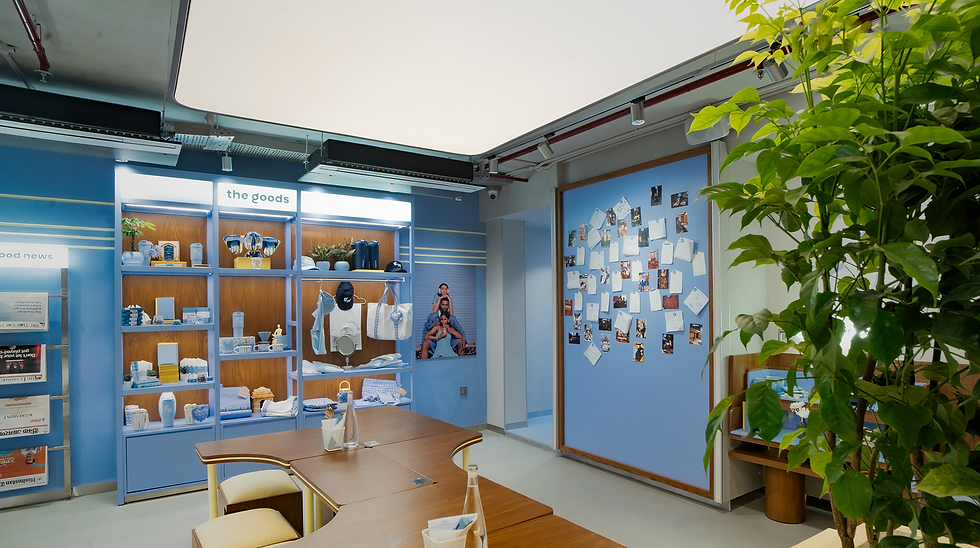
Champion Blue is the signature colour of the in good co identity, chosen as a distinctive visual asset that is instantly recognisable across every brand touchpoint. Rather than selecting an arbitrary blue, the colour was meticulously developed using the Birla Opus Colour Guide to identify the precise Pantone shade that best expressed the brand's personality while ensuring consistency across print, packaging and environmental applications.The supporting palette reinforces, rather than competes with, Champion Blue. Butter Yellow introduces controlled contrast, while Ivory serves as the foundational neutral.


The Stripe Story
India has always had a rich visual language of stripes. From woven saris and shawls to handloom textiles across different regions, stripes have long served as markers of identity, craft and place.
The stripe library was developed through a process of abstraction. Traditional Indian textiles were deconstructed into their fundamental visual components—stripe width, interval, repetition, colour sequencing and rhythm. These parameters were then standardised into a modular graphic framework, enabling diverse regional weaves to be expressed through a single, coherent design system.


Iconography
The iconography is derived directly from the stripe library, with each icon constructed using parallel horizontal stripes instead of continuous outlines or filled silhouettes. A defined set of construction rules governs stripe thickness, spacing, alignment and proportions, creating a cohesive and recognisable visual language. Icons are intentionally partially revealed, allowing negative space to complete the form. The modular, scalable system supports a comprehensive icon library across menus, wayfinding, packaging, digital interfaces, merchandise and functional information.


Brand Imagery
While developing the brand imagery, we extended the stripe system beyond pattern to create a distinctive illustration language. Using the principles of rhythm, proportion and repetition, horizontal stripes were layered to construct abstract cityscapes that capture the essence of Indian neighbourhoods.Rather than depicting places literally, urban environments were distilled into essential forms through varying stripe densities, widths and colour blocks. A human figure remains the focal point in every composition, reflecting in good co's belief that cities are defined by the people who inhabit them.
To enable hyperlocal storytelling, each artwork incorporates a single iconic local element—such as Mumbai's kaali-peeli taxi—allowing the imagery to adapt across cities while maintaining a consistent visual language rooted in the stripe system.


Tone of Voice
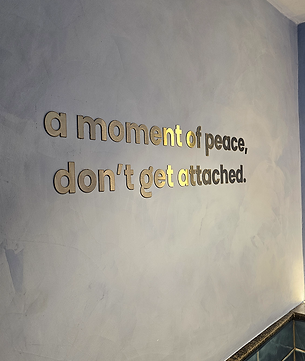
For in good co, we developed a tone of voice inspired by the Pop Philosopher—transforming everyday observations into moments of reflection through warmth, wit and simplicity. Instead of conventional marketing language, the brand speaks through small truths, thoughtful humour and relatable insights, making ordinary interactions memorable.
Balancing elegance with informality and playfulness with substance, the voice is conversational, insightful and consistently applied across menus, packaging, merchandise, emailers and in-store communication.



Photography Style
The photography direction was conceived as an extension of the brand strategy, ensuring that every image communicated the values at the heart of in good co. The studio led the creative direction across every aspect of the shoot—from lighting, styling, casting and art direction to composition, pacing and colour treatment—to create a cohesive visual language that felt warm, contemporary and deeply human.
Rather than relying on conventional hospitality photography that places food and beverages at the centre, the imagery shifts the focus to the moments that unfold around them. Friends immersed in conversation, individuals working quietly, families gathering and strangers sharing a table become the protagonists of the brand story. Coffee is present, but it is never the hero.
Natural light, candid interactions and relaxed compositions were intentionally used to create photographs that feel observed rather than staged.


