

TEAM
Agency: LOCAL
GREEN CURE
2021
GreenCure
What we did:
-
Branding
Market Research + Immersion
Brand Identity Rebrand + Elements
Brand Guidelines
-
Packaging
-
Mobile Website
Illustrations by:
Anubha Jain and Siddhant Jumde
brief
Green Cure is a healthcare company that combines German herbal science with Indian Ayurveda. It wanted a refreshed design architecture that would convey the efficacy, safety and trustworthiness of its products. The existing design was scattered with regards to sales, packaging, brand values and customer experience, and undifferentiated in comparison to other OTC products on the shelf.
SOLUTION
Through in-depth research into medical packaging and workshops with medical practitioners, patients and pharmacists, LOCAL developed a comprehensive visual identity and colour-coded packaging system to simplify customer experience. The new Green Cure design and branding system was consistent, clearly communicating the efficacy and credibility of the products to the customer. LOCAL also implemented a design and information architecture that would incorporate future product lines seamlessly.


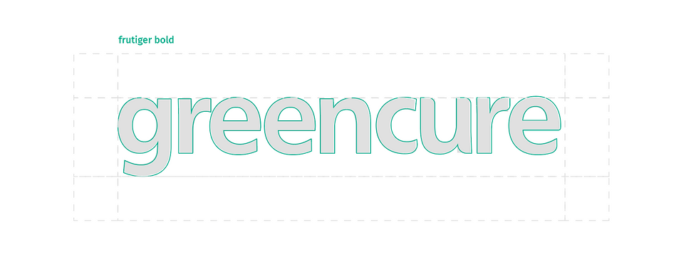
LOGO
While the earlier logo of Green Cure consisted of a leaf element, LOCAL redesigned the logo to create a custom typeface for better visibility on packaging. Inspired by the leaf motif, the new logo conveyed a modern, reassuring and trustworthy brand through the soft edges of the type.

new logo
old logo


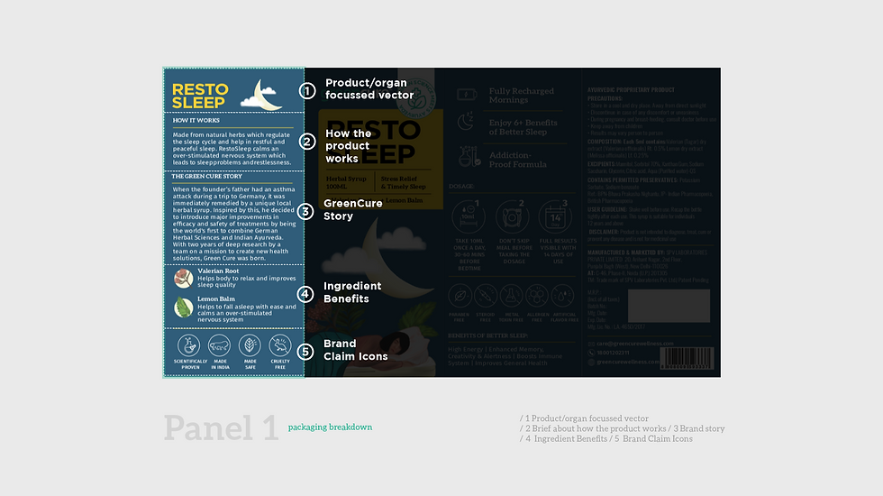
A solution focussed packaging : visual systems
Eschewing the common trope of illness and ailment, LOCAL designed the packaging to convey wellness and cheerfulness. With a focus on clarity, credibility and differentiation on the counter, LOCAL’s solutions-oriented packaging for Green Cure showed the positive effects of the product for the customer. The new packaging system focussed on multiple levels:
1. Information hierarchy for clarity and comprehension
2. Colour-coded product categorisations based on the organ to benefit
3. Illustrations showcasing the positive impact of the product in human terms


panel INFORMATION ARCHITECTURE
The Green Cure packaging featured a main illustration panel that classifies the product according to the organ it is associated with, the ingredients it contains and imagery of the human benefit of the product. The design system for the Green Cure packaging builds an information hierarchy for conveying product composition and benefits, easy identification in store and colour-coding to differentiate between product categories.


colour systems
Product colour
coding system +Vectors for
ecosystems
To simplify classification of different product offerings, every Green Cure product is categorised into a colour code according to its function and area of effect. This system of classification is used across packaging and on the Green cure website.

photographs
Being a bedside table product


website & digital
LOCAL extended the design philosophy of the Green Cure packaging to the web, developing a mobile-first web experience that expresses the brand promise of wellness as well as easy navigation through colour-coded product categories.


LOCAL helped us with the complete rebranding of Green Cure. We were impressed by the quality of their work. The team was very patient in understanding our vision and delivered above expectations. Roshnee personally oversaw everything and ensured all our inputs were being taken care of. We saw an increase in our CTRs due to better design. Our customers appreciated the packaging and found it much cleaner and appealing than the previous packaging.
Sanchit Garg, Founder - GreenCure